

How to Match Thread Colors with Towel Colors for a Premium Look
Understanding Color Theory
In the realm of textile design, color theory plays a pivotal role. The science of how colors interact with one another can significantly influence the overall aesthetic appeal of home textiles, such as towels. Complementary, analogous, and monochromatic schemes can create various moods and settings, making it imperative for designers and homeowners alike to understand these principles when choosing thread colors.
Complementary Colors
Complementary colors, which sit opposite each other on the color wheel, tend to produce a striking visual contrast. For instance, pairing a vibrant teal towel with orange threads not only draws attention but also adds a dynamic quality to the overall presentation. This approach is particularly effective in contemporary designs where bold visual statements are desired.
Analogous Colors
Analogous colors, located next to each other on the color wheel, provide a more subtle and harmonious look. For example, selecting shades of blue and green for both towels and threads can yield a serene and cohesive appearance. This method is often favored in environments meant for relaxation, such as spas or bathrooms.
Choosing the Right Thread Material
The material of the thread also contributes considerably to the overall aesthetic. High-quality threads made from cotton or linen not only enhance durability but also offer a premium appearance. When matched with soft, plush towels, such threads can elevate the tactile experience, making them visually appealing and functional.
Thread Patterns and Textures
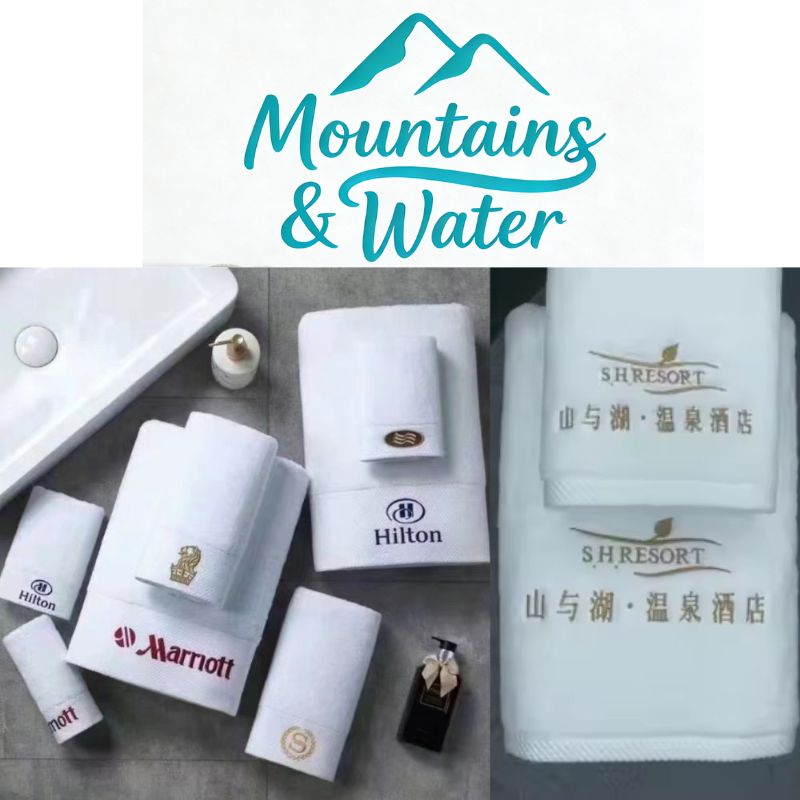
In addition to color, the pattern and texture of the thread should be considered. Decorative stitching or embroidery using contrasting colors can add a layer of sophistication. For example, a plush white towel adorned with gold thread creates an elegant feel, while playful patterns can lend a more casual, fun vibe.
Practical Tips for Matching Colors
- Test Samples: Before committing to a particular combination, it's advisable to test samples under different lighting conditions. Daylight can alter perceptions of color, so it's important to see how your choices appear in natural light, as well as artificial lighting.
- Use a Color Wheel: A color wheel is an invaluable tool. By understanding the relationships between different hues, you can easily identify potential complementary or analogous colors that will work well together.
- Consider the Environment: The surrounding decor should not be overlooked. Towels are often used in conjunction with other textiles, such as bath mats or shower curtains. Ensuring cohesion among all elements will contribute to a polished look.
- Explore Trendy Palettes: Keeping abreast of current design trends can inspire fresh ideas. A brand like Mountains & Waterl often emphasizes seasonal color palettes that resonate with nature, offering guidance on which combinations may be most appealing.
Final Considerations
Ultimately, achieving a premium look involves a blend of thoughtful color selection, material quality, and awareness of the surrounding environment. By applying the principles of color theory and paying attention to texture and pattern, one can curate a collection of towels that not only function well but also serve as a statement piece within any bathroom setup. Remember, the right choice of thread color can transform a simple towel into a luxurious item worthy of admiration.